Flattening the Pyramid - Best Practices for Readable Jetpack Compose UIs
This article explores key strategies and best practices to combat the Pyramid of Doom, ensuring your Compose code remains flat, readable, and scalable.

Sun Nov 30 - Written by: JesusDMedinaC
Flattening the Pyramid - Best Practices for Readable Jetpack Compose UIs
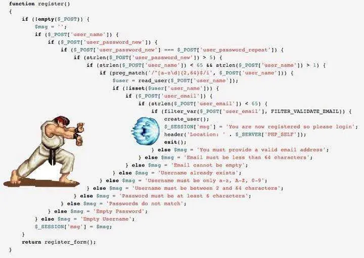
If your compose code looks like a hadouken, keep reading.
Jetpack Compose is a modern, declarative UI toolkit for Android that simplifies and accelerates UI development. Its power lies in its compositional nature—building complex UIs by combining small, independent functions called composables. However, this very nature can lead to a common pitfall: deeply nested code structures that are hard to read and maintain. This is often referred to as the “Pyramid of Doom” or an “arrow shape” in the code, where each level of nesting adds another layer of indentation.
This article explores key strategies and best practices to combat this, ensuring your Compose code remains flat, readable, and scalable.
The Challenge - The Pyramid of Doom
Consider a simple login form. A naive implementation might look like this:
@Composable
fun LoginForm() {
    MaterialTheme {
        Surface(modifier = Modifier.fillMaxSize()) {
            Box(contentAlignment = Alignment.Center) {
                Column(horizontalAlignment = Alignment.CenterHorizontally) {
                    Text("Welcome Back!")
                    OutlinedTextField(
                        value = "",
                        onValueChange = {},
                        label = { Text("Email") }
                    )
                    OutlinedTextField(
                        value = "",
                        onValueChange = {},
                        label = { Text("Password") }
                    )
                    Button(onClick = {}) {
                        Text("Login")
                    }
                }
            }
        }
    }
}
While simple, the indentation already starts to grow. As features like error messages, icons, and helper texts are added, this pyramid can quickly become unwieldy.
Strategy 1 - Extract, Extract, Extract!
The most powerful technique to flatten your UI code is to break down large composables into smaller, single-purpose functions.
Instead of one monolithic function, your UI should be composed of several small, well-named pieces.
Benefits
A top-level composable that reads like an index is much easier to understand than one giant implementation. That’s what we call readability.
In addition, reusability may be achieved by extracting a custom EmailField can be reused across login, sign-up, and profile screens.
Finally, in order to have a more testable and previewable code, Each small component can be tested and previewed in isolation, making development faster and more reliable.
Strategy 2 - Master State Hoisting
Extracting components is most effective when paired with state hoisting. This is a core pattern in Compose.
State hoisting is the practice of making your components stateless by moving their state up to their caller. A stateless component is one that does not hold or manage its own state (i.e., it doesn’t use remember { mutableStateOf(...) }).
How It Works
- State flows down: A component receives its state as parameters.
- Events flow up: A component exposes events (like
onClickoronValueChange) as lambda functions that are passed up to the caller.
Why It’s a Game-Changer
Having a single Source of Truth means that the state is owned by a common ancestor (like a ScreenModel or a screen-level composable), preventing state duplication and bugs.
In other hand, a stateless PasswordField doesn’t care where its state comes from. It enhanced reusability by just displaying the data it’s given and reports when something changes. It’s universally reusable.
We can even separate the “what” (the UI) from the “how” (the state management logic) by decoupling the state management logic from the UI.
Strategy 3 - Embrace the Power of Modifiers
Compose’s Modifier system is designed to decorate or add behavior to composables without adding extra nesting. Before wrapping a component in a layout for a simple tweak, check if a modifier can do the job.
Instead of this (more nesting):
Box(modifier = Modifier.padding(16.dp)) {
    Text("Hello, Compose!")
}
Prefer this (flatter):
Text(
    "Hello, Compose!",
    modifier = Modifier.padding(16.dp)
)
This keeps the visual hierarchy flat and makes the chain of modifications applied to a component explicit and easy to read.
Putting It All Together - A Practical Refactoring
Let’s apply these principles to the SignInOrSignUp function from this project.
Before - The Monolithic Approach
The original function, while functional, mixes state management, UI implementation for multiple components, and business logic calls.
@Composable
private fun SignInOrSignUp(authScreenModel: AuthScreenModel) {
    val state by authScreenModel.state.collectAsState()
    var email by remember { mutableStateOf("") }
    var password by remember { mutableStateOf("") }
    // ... more state and logic ...

    Column(horizontalAlignment = Alignment.CenterHorizontally) {
        Text(text = "Sign in")
        OutlinedTextField(
            value = email,
            onValueChange = { email = it; authScreenModel.onEmailChange(it) },
            label = { Text("Email") }
        )
        OutlinedTextField(
            value = password,
            onValueChange = { password = it; authScreenModel.onPasswordChange(it) },
            label = { Text("Password") },
            trailingIcon = { /* ... */ }
        )
        OutlinedButton(
            onClick = { authScreenModel.authenticate() },
            // ...
        ) {
            Text("Sign in")
        }
        // ... more UI
    }
}
After - The Compositional Approach
By extracting smaller components and hoisting their state, the SignInOrSignUp function becomes a clean, declarative layout.
// The main composable is now clean and readable
@Composable
private fun SignInOrSignUp(authScreenModel: AuthScreenModel) {
    val state by authScreenModel.state.collectAsState()
    val unAuthenticated = when (val authState = state) {
        is AuthScreenState.UnAuthenticated -> authState
        else -> return // Or a default state
    }

    Column(modifier = Modifier...) {
        AuthHeader(isSignIn = unAuthenticated.haveAccount)

        EmailField(
            email = unAuthenticated.email,
            onEmailChange = authScreenModel::onEmailChange,
            isError = !unAuthenticated.isValidEmail
        )

        PasswordField(
            password = unAuthenticated.password,
            onPasswordChange = authScreenModel::onPasswordChange,
            isPasswordVisible = unAuthenticated.passwordVisible,
            onVisibilityChange = authScreenModel::onPasswordVisibilityChange,
            isError = !unAuthenticated.isValidPassword
        )

        SubmitButton(
            isSignIn = unAuthenticated.haveAccount,
            isEnabled = unAuthenticated.isValidEmail && unAuthenticated.isValidPassword,
            onClick = authScreenModel::authenticate
        )

        // ... and so on
    }
}

// --- Child Components (Stateless & Reusable) ---

@Composable
private fun EmailField(
    email: String,
    onEmailChange: (String) -> Unit,
    isError: Boolean
) {
    OutlinedTextField(
        value = email,
        onValueChange = onEmailChange,
        label = { Text("Email") },
        isError = isError,
        singleLine = true,
        modifier = Modifier.fillMaxWidth()
    )
}

@Composable
private fun PasswordField(
    password: String,
    onPasswordChange: (String) -> Unit,
    isPasswordVisible: Boolean,
    onVisibilityChange: () -> Unit,
    isError: Boolean
) {
    OutlinedTextField(
        value = password,
        onValueChange = onPasswordChange,
        label = { Text("Password") },
        isError = isError,
        singleLine = true,
        visualTransformation = if (isPasswordVisible) VisualTransformation.None else PasswordVisualTransformation(),
        trailingIcon = {
            IconButton(onClick = onVisibilityChange) {
                // ... Icon logic
            }
        },
        modifier = Modifier.fillMaxWidth()
    )
}
Conclusion
Writing clean, readable, and maintainable UI code in Jetpack Compose is not automatic; it’s a discipline. By embracing its core principles—composition over inheritance, state hoisting, and the power of modifiers—you can avoid the “Pyramid of Doom” and build scalable applications.
Breaking down large UIs into small, stateless, and reusable components is the key to unlocking the full potential of Compose. It leads to a codebase that is not only easier to read but also simpler to test, debug, and evolve over time.